

From the beginning of my career in content, which has included business journalism, digital marketing, content strategy and product content in several successful tech startups and scaleups, most of my strategic decisions have been based on the goal of getting as many people to read my words as possible.
But recently in Mews, we've shifted from talking about User Engagement to talking about User Disengagement. It’s a concept that will be familiar to those in touch with the world of product design: we want customers to use our property management system as little as possible.
We’re designing our product to take hoteliers out from behind their computers. We envision a predictive system with no screens at all. Imagine that!
This got me thinking. It's an exciting new direction for our product, but how does User Disengagement translate to product content—and how can we measure the success of our content when disengagement, rather than engagement, is the goal?
|
Table of contents |
Why user disengagement should be your guiding principle
Everybody loves saving time. Imagine if you wanted to write an email and you needed to consult a guide because the software wouldn’t work the way you expected it to.
Especially in hospitality tech, product teams have a special opportunity: to use technology to bring people together. Human connections are the heart of hospitality, so why shouldn’t hotels be the same? Stop waiting in lines to check in or check out and have a coffee and a friendly conversation with the concierge instead. Or better yet, get a digital key on your phone the moment you walk into the lobby, then go directly to your room.
Disengagement, not disregard
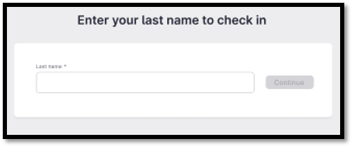
The benefit of User Disengagement in Content Design is clear. For example, at Mews we recently updated the way that guests can check in using our Kiosk.
It was a simple change, but we realized that allowing guests to check in using only their last name, rather than their full name, would speed up the process at a key touchpoint of the customer experience.
Our hunch paid off, and after making this change we saw:
- 14% reduction in check-in abandonment
- 61% (86-second) reduction in time spent finding a reservation
That’s the power of User Disengagement! But how does this principle apply to product documentation?
Designing documentation for disengagement
We should apply the same principles to our documentation as we do to our product. People read help guides because they’re having trouble doing something. They don’t actually want to read the guide. In fact, reading documentation has no value for the user, unless a solution is provided – the sooner, the better.
The faster you can get the user to understand the solution they need, the faster they can get out of your help portal and finish doing what they’re trying to do.
So, if your goal is to increase the number of people using your product documentation and to keep them there as long as possible, you’re doing it wrong.
Why most engagement metrics don’t work
Traditional content metrics emphasize traditional engagement: page views and time spent on the site.
But from the user’s point of view, these metrics reward bad behavior. Remember: success for users means getting back to work. So, the less time users spend with your product documentation, the better.
How to write documentation that’s easier for users to scan and close
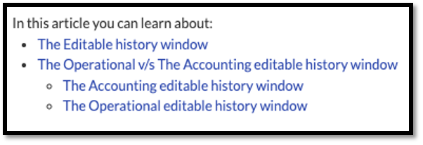
One thing we’ve implemented in our help guides is a navigational element, a table of contents at the beginning of each article that lets users skip and scan, clicking and linking to the precise part of the article that will be most useful for them:
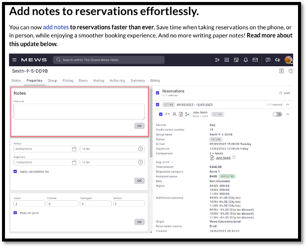
We’ve also enriched our text content with gifs, images and product renders to visualize the steps described and break up the text, making the article easier to scan and more appealing to a broader spectrum of verbal and visual learners:
How to measure the business impact of product documentation
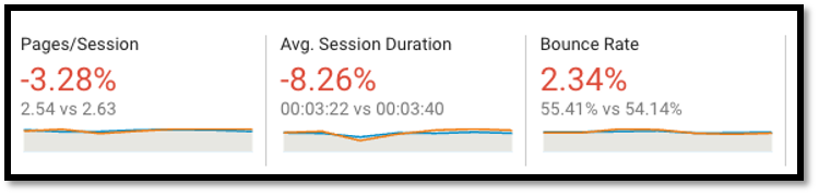
Page views are vanity metrics. If we embrace User Disengagement as a guiding principle, we should begin looking more closely at bounce rate.
To a certain extent, a higher bounce rate is better, and fewer pages per session suggests that users are finding answers in the first document they open. This means your content is helping users solve their problems themselves – and quickly – thus lessening the burden on Customer Support.
This can be counterintuitive for content strategists who are used to measuring how much and how often users engage with content. But it’s also an opportunity for greater collaboration between Technical Writers and Content Designers – after all, if customers keep coming back to a particular guide to learn how to do something, that means something is wrong in the product.
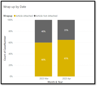
It’s also important to monitor metrics like case deflection and article attach rate, so that the business impact of product documentation becomes clear to the entire organization.
Customer Support is a challenge for every company. Anything that can be done to eliminate tickets before they arise, and to aid Customer Support agents in their quest to solve customers’ problems, should be done immediately. Designing documentation for User Disengagement is an important step in the process: if users have to spend too much time reading a guide, they’re just going to contact Customer Support.
Many people get into content careers because they love writing. And that passion infuses everything they do. But the most effective product content is not about the love of language, it’s about love for the customer and a passion for helping them work more efficiently.

.webp)